Submitted on
Source: Winnipeg Free Press
With lot sizes getting increasingly smaller to save costs, builders have been challenged to make a 1,700 square-foot home feel as spacious and livable as a 2,000-plus sq. ft. home.
It turns out this is easier said than done.

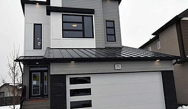
The design team at A & S Homes, however, has come up with a new plan that proves great style and livability can come in a smaller package, says Adam Virgilio of Royal LePage Alliances, sales representative for A & S Homes’ show home at 71 Crestmont Dr. in Bonavista.
“This home has been designed so it can fit on a 32-foot-wide lot,” he says, adding that the lot at 71 Crestmont is moderately wider. “The big challenge that comes with building a home on a narrower lot is to give it a sense of space inside.”
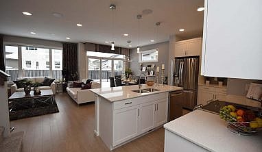
To accomplish that, A & S design team came up with a floor plan that maximizes every available inch of space. At the same time, they gave the great room a square rather than rectangular shape, giving it both excellent width and depth.
“That’s a really important feature,” notes Virgilio. “When you spend time in your great room, you don’t want to feel like you’re living in a tunnel.”
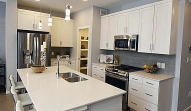
The Crestmont’s great room is plenty spacious courtesy of a well-ordered layout. For starters, the island kitchen was nestled neatly away to the right of a four-foot-wide hallway that leads into the great room from the generous foyer.
Thanks to the kitchen’s modified galley design, and a large island that fits the space perfectly, function abounds, yet it doesn’t encroach on the other two spaces, particularly the dining area.
In fact, the dining area is far bigger than expected, says Virgilio.

“It’s a really good size, it’s not squished in at all,” he says. “There’s lots of space between it and the island, and there’s about three to four feet of space between it and the sofa, which defines the family room. That leaves a nice, wide aisleway to the patio door on the rear wall. It leads out to a generous backyard deck, and the two windows to the side of the door let in all kinds of light.”

Meanwhile, the family room to the left, which is defined neatly by a one third wall with tempered glass cut-out beside the upper-level staircase also offers ample space, and style.
“There’s actually about 13 to 14 feet of space from the sofa to its side wall. It was also boxed out about three to four feet to give it more depth,” he says. “That boxed out area features a picture window on the rear wall, along with space for a love seat. Its focal point is an optional entertainment unit with gas fireplace set in a three-tone tile feature wall and TV niche with maple shelving and trim.”
Virgilio adds the finishes in the great room give the area a cozy, welcoming feel.
“They’re modern yet warm white cabinets and off-white quartz countertops in the kitchen, stainless appliances, light grey/taupe and white colour tones on the walls and textured brown laminate plank flooring,” he says, adding that a walk-through pantry has also been a hit with everyone. “Everything comes together to create an area that looks great, and is very functional.”
Head upstairs via the extra-wide upper level staircase and you’ll notice it was cleverly carved out of the wall opposite the kitchen to increase the feeling of space and add light from a window on its side wall, and you’ll also find an efficiently-laid-out second floor.
That efficient design centres around a long wall that was placed between the master suite and secondary bedrooms, says Virgilio.
“The two secondary bedrooms — they’re both good-sized — were placed off to the right at the end with that wall separating them from the master suite. The neat thing about that wall is that is holds a four-piece bath, which is next to the secondary bedrooms, and a big laundry room, which is next to the master suite.”

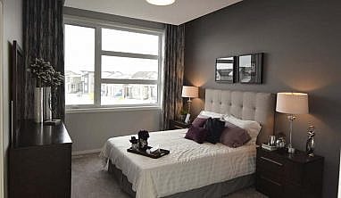
Privately positioned at the end of a brief hallway, it’s one cool, creative space.
“It features a massive picture window and a 10-foot ceiling with a floating white bulkhead that contrasts with the grey ceiling and walls that surround it,” he says. “The ensuite comes with a five-foot walk-in shower, 24-inch, taupe tile floor and a huge walk-in closet with large window.”
The Crestmont proves that lot size doesn’t necessarily compromise livability, especially when a builder embraces the challenge of doing more with less, concludes Virgilio.
“It’s a very flexible, well-designed home,” he says. “It can have three or four bedrooms, and can even come with a side entrance that can serve as an entrance for an in-law or rental suite downstairs. Even though it’s a smaller home, it provides the livability and style that families are looking for at a reasonable price.”
By: Todd Lewys
Originally published by Winnipeg Free Press on January 23, 2021
Visit this home and others to see first hand how our A&S Homes maximize every inch of livable space.

 Discover our It’s Key Time moments